E-services — just as easy for my mom as for you and me?
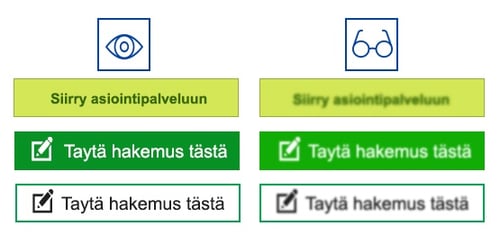
National public services are slowly moving to the electronic environment. No one will be surprised that bank issues, doctor’s appointments, and hotel bookings will be made online. Is it as easy for my mom as it is for me or for you who are reading this blog? When designing a web service, do we always take in to consideration any special needs the users might have? Is each button designed accessible, and how will people with visual disabilities see the button? Is the contrast sufficient, and is the font readable? What about immigrants, who do not know the language very well? Should an icon or image be added to important pages so that the user intuitively understands what is said in this section?
I'll tell you a personal story. I have an acquaintance, an elderly lady, whom I occasionally help with computer use and filling forms online. She has just been in surgery and is not able to walk. She was asked for five different attachments to her applications, which he should send to the authorities. Because of the surgery, she asked me for help, and I suggested to do this online, which is the most convenient option for me.

After opening the website of the service provider, I allowed her to operate by herself. As a visual designer I was very interested in how fast she would find the right button to go to the online service. It took time. After authentication we found the right application and linked the photos as an attachment and - ERROR! The maximum size 5 Mb of allowed images was exceeded. I resized the photographs. Hurrah!
I watched with interest how the elderly lady interacted with online service. A simple task like this can be a big challenge for many seniors. I must add that usually she successfully manages bank services online. How large a proportion of people really needs our support?
An accessible website enables the access to information and interaction for many people with disabilities. The aim of accessibility is to guarantee equal access to e-services for everyone. Because of my experience, I consider accessibility to be a very important aspect of the digitalization journey. Here are some simple step-by-step examples on how to design accessible webpages.
Font at the visual design
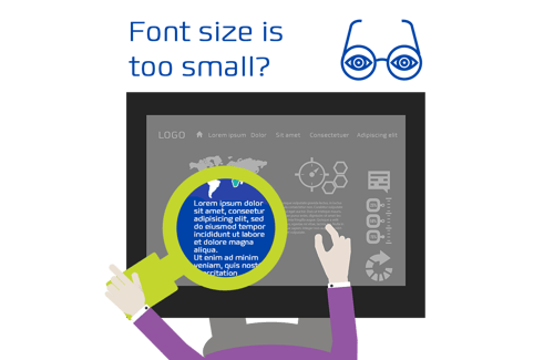
Imagine you are nearsighted, and you find that reading text on a smartphone or tablet is unsuccessful and reading glasses have been left at home. Aging people are an ever-growing user group. For them, and for other people with visual impairments, fonts and font size, page color choices with contrasts, and clarity of text are important. However, these are just a few of the many features that can make it easier or more difficult to read and understand the page content.

Users have the option of magnifying the text with a browser setting, but many older people cannot use browser tools, or do not know what they are or where to find them. For many, the browser is just a window for browsing sites. That is why it is good to think about the text in advance. The font must be legible, easy to read, quite large, and the color contrast should be sufficient according to WCAG.
Contrast and image use are an important part of accessibility
The high contrast between text and background color ensures easy readability, especially for the visually impaired users. Webpages background color should be neutral which will provide a clear contrast with the text color. Background’s color scheme should be moderate accompanied with appropriate images. It is advisable to avoid using the red and green colors near each other, because it could bring difficulties to red-green blind people. Red-green tones should provide high contrast to each other, or the elements need to be accented with symbols or icons.
- If text is overwritten, there is generally not enough contrast. Alternatively, install a transparent colored background under the text or use a suitable photo, although that is more difficult.
- It would be great if, when designing a digital service, you remember the golden mean philosophy, as it helps with intuitive interaction.
Accessibility via keyboard

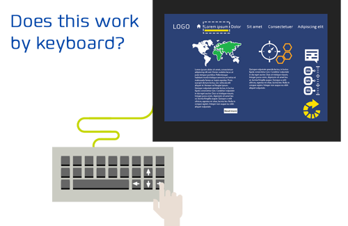
Visually impaired people often use a keyboard instead of a mouse, or they use a screen reader interacting with a computer or a mobile device. These users don’t immediately get a general view of the content on the page, rather they have to tap to the end to understand webpage subject. The screen reader can be easily navigated with the tab, arrow keys, or access key menus. Using the service without the mouse allows the user to check whether all the functions are available with the keyboard.
At the same time, it is possible to determine whether the visual focus used at the site is sufficient, so that the user is always able to detect which interface element is targeted
at a given time.
For example, keyboard browsing:
- The amount of content is manageable and well-grouped so that the visually impaired user can get an understanding of the page by going through the headings in sequence
- The content must be arranged logically
- Navigating should be at the beginning of the page and, and there should be enough titles for content.
Accessibility as an aspect of professional responsibility
The above examples are just a few points that accessibility can help with. Accessibility can also be affected by poor Internet access, small screens, mobile challenges, voice content, lack of sign language content, lack of language choice, and more. Accessibility is therefore an essential part of Design for all -principle. This is to ensure equal access to digital services for all users, regardless of hearing or vision, motor difficulties or other disabilities. From time to time my oldest son and I discuss different occupations. I try to relay my vision that any job is a worthy activity, if you can produce something good and useful for people. When I design a website, being a designer, I keep web accessibility in mind. And I hope that any user can easily operate on this website. In my opinion, web accessibility should be an aspect of professional responsibility.
Thank you Heidi Laitinen (User Experience Designer) and Taina Lempiäinen (Senior User Experience Specialist) for you help in writing this blog.


